Molecular dynamics visualization software typically colors each atom by its identity but allows a few other options.
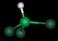
Example: a chloroform molecule (CHCl3) looks like this:

The hydrogen is white, the central carbon is green, and the three chlorines are dark green.
But simplify it to sticks like this:

And a truncated octahedron of them looks like this:

We can also choose to color this "box" of chloroform by index. This defines the color each atom by its position in the text file that the program reads. Why would anyone want to do this? Seems so meta and removed from physical meaning.
Here's one reason. Look at the box we have, colored by index:

We can clearly see an artifact of its construction. The regions of color reveal how this system was created. Smaller boxes were juxtaposed and then the system was trimmed to the space-filling truncated octahedron geometry. This is troubling since it reveals that the system was certainly not well mixed after this construction.
If we run this system for 200 picoseconds, we can see the effect using the same color scheme:

Now this looks more well-mixed. Obviously not a rigorous demonstration that the system has reached equilibrium, but a fun way to survey configuration files.

The hydrogen is white, the central carbon is green, and the three chlorines are dark green.
But simplify it to sticks like this:

And a truncated octahedron of them looks like this:

We can also choose to color this "box" of chloroform by index. This defines the color each atom by its position in the text file that the program reads. Why would anyone want to do this? Seems so meta and removed from physical meaning.
Here's one reason. Look at the box we have, colored by index:

We can clearly see an artifact of its construction. The regions of color reveal how this system was created. Smaller boxes were juxtaposed and then the system was trimmed to the space-filling truncated octahedron geometry. This is troubling since it reveals that the system was certainly not well mixed after this construction.
If we run this system for 200 picoseconds, we can see the effect using the same color scheme:

Now this looks more well-mixed. Obviously not a rigorous demonstration that the system has reached equilibrium, but a fun way to survey configuration files.
Comments
Post a Comment